Visual Data and Interactive Data
Data is not just data. How we present data speaks to how we want to communicate what the data is useful for, and the kinds of change we want to incite based on interaction with or comprehension of that data.
Visual data and Interactive data are important to scholars and NGOs alike as they endeavor to communicate their stories. They are useful because they require (or allow) processing in ways that text based communication does not. Consider the following infographic.
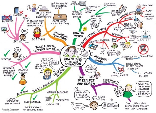
Distractable Credit: Learning Fundamentals
I could put all these items within the image in an linear outline format. However, by putting it in a picture format the viewer (of the story [data+graphic element]) is more likely to read some of it because they find some of the elements of iconicity interesting. The outline does not show relationships in two-dimensional space either.
As we consider that many of the people we interact with have the visual processing tendencies, it becomes necessary to have diverse teams which are comprised of artists, data mongers, and language development specialist who can collaborate to tell/produce and communicate the interesting concepts and stories we discover and negotiate in the Language Development Movement.
Websites with interactive devices for explaining trends via large data sets
The following are some screen shots of websites which I feel have made an effort to explain complex stories, supported through complex data to audiences via interactive data presentations1.
Helping the world understand where the global problem is in Literacy.
http://www.uis.unesco.org/literacy/Pages/adult-youth-literacy-data-viz.aspx - UNESCO
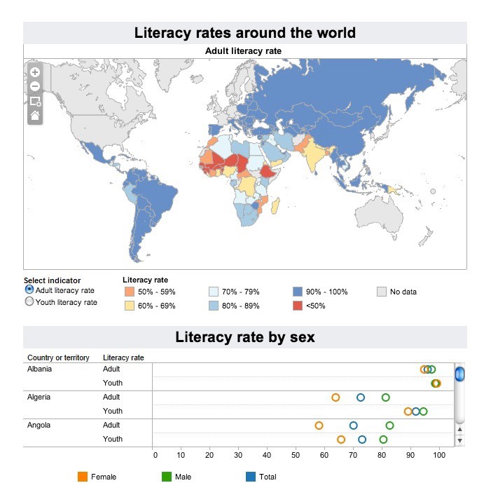
World Literacy Rates Credit: UNESCO
Helping Citizens know how they are using energy.
http://www.evoenergy.co.uk/uk-energy-guide/ - Tree and Energy
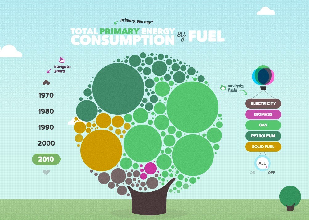
Energy Consumption Credit: evoenergy.co.uk
Helping citizens know how their money is being spent:
http://www.wheredoesmymoneygo.org/bubbletree-map.html#/~/grand-total–2010- - National Budget
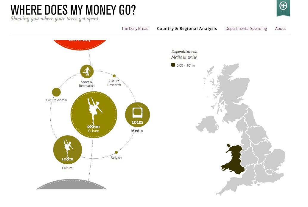
Government spending in Wales Credit: wheredoesmymoneygo.org
Who re-tweets remarks from the candidate - showing political affinity to the remarks.
https://election.twitter.com/map/#t245509634897633281 This twitter map was also featured in the NYTimes (accessible at the Internet Archive).
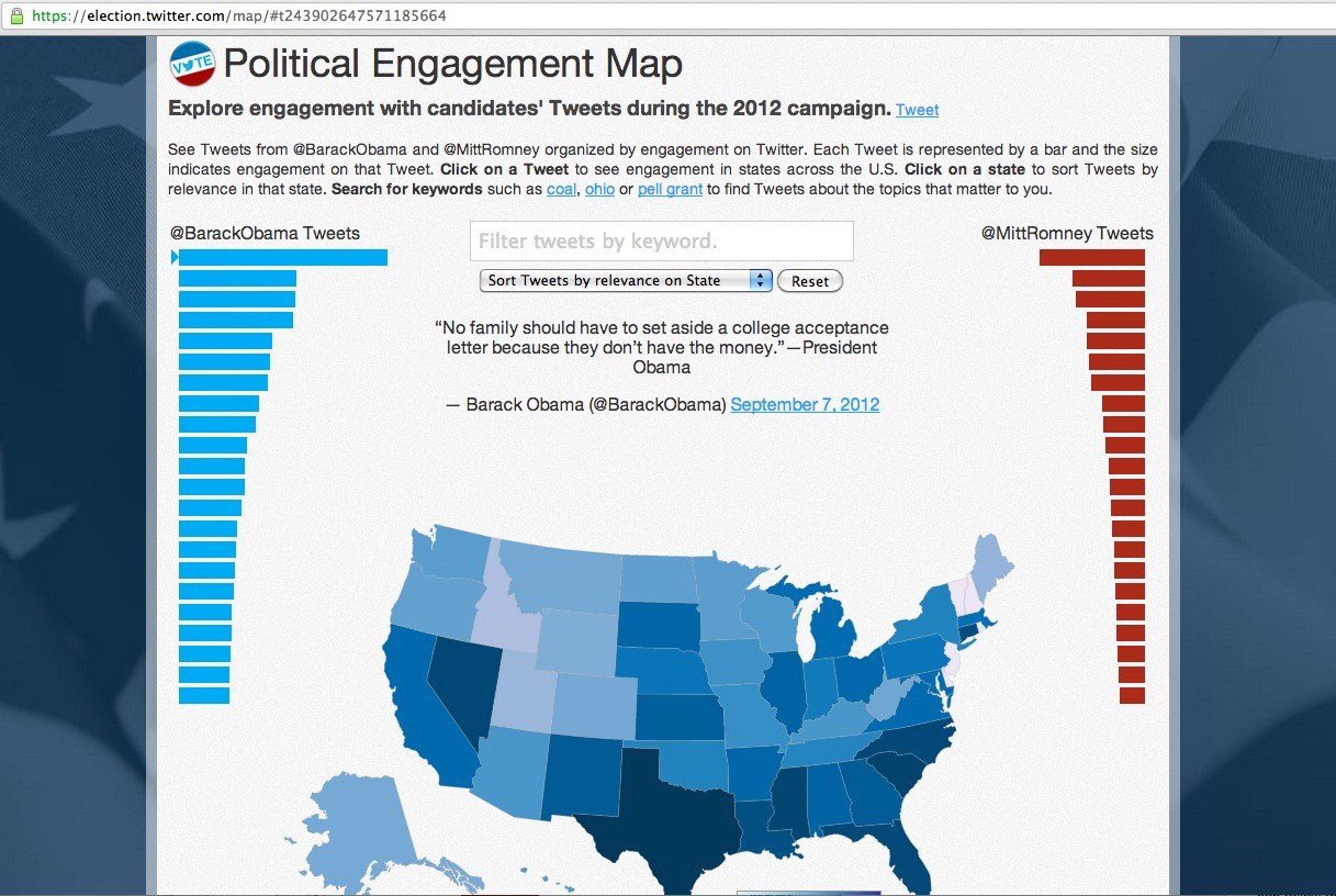
Who re-tweets remarks from the candidate Credit: Twitter
California Elections
http://source.mozillaopennews.org/en-US/articles/wyncs-california-elections-data
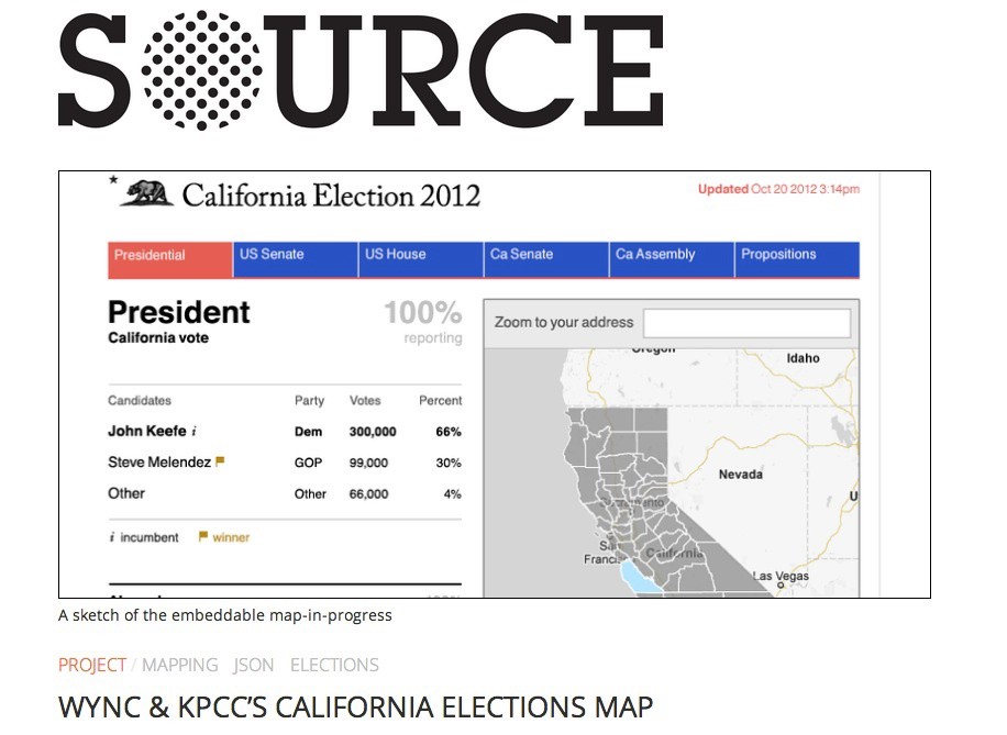
California Elections visualized live Credit: WYNC & KPCC
Facebook: Mapping the World’s Friendships
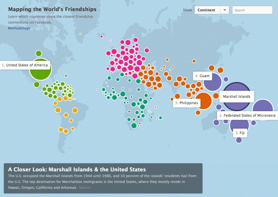
The U.S. occupied the Marshall Islands from 1944 until 1986, and 10 percent of the islands’ residents hail from the U.S. The top destination for Marshallese immigrants is the United States, where they mostly reside in Hawaii, Oregon, California and Arkansas. Credit: Stamen Studio
Other non-interactive info graphics
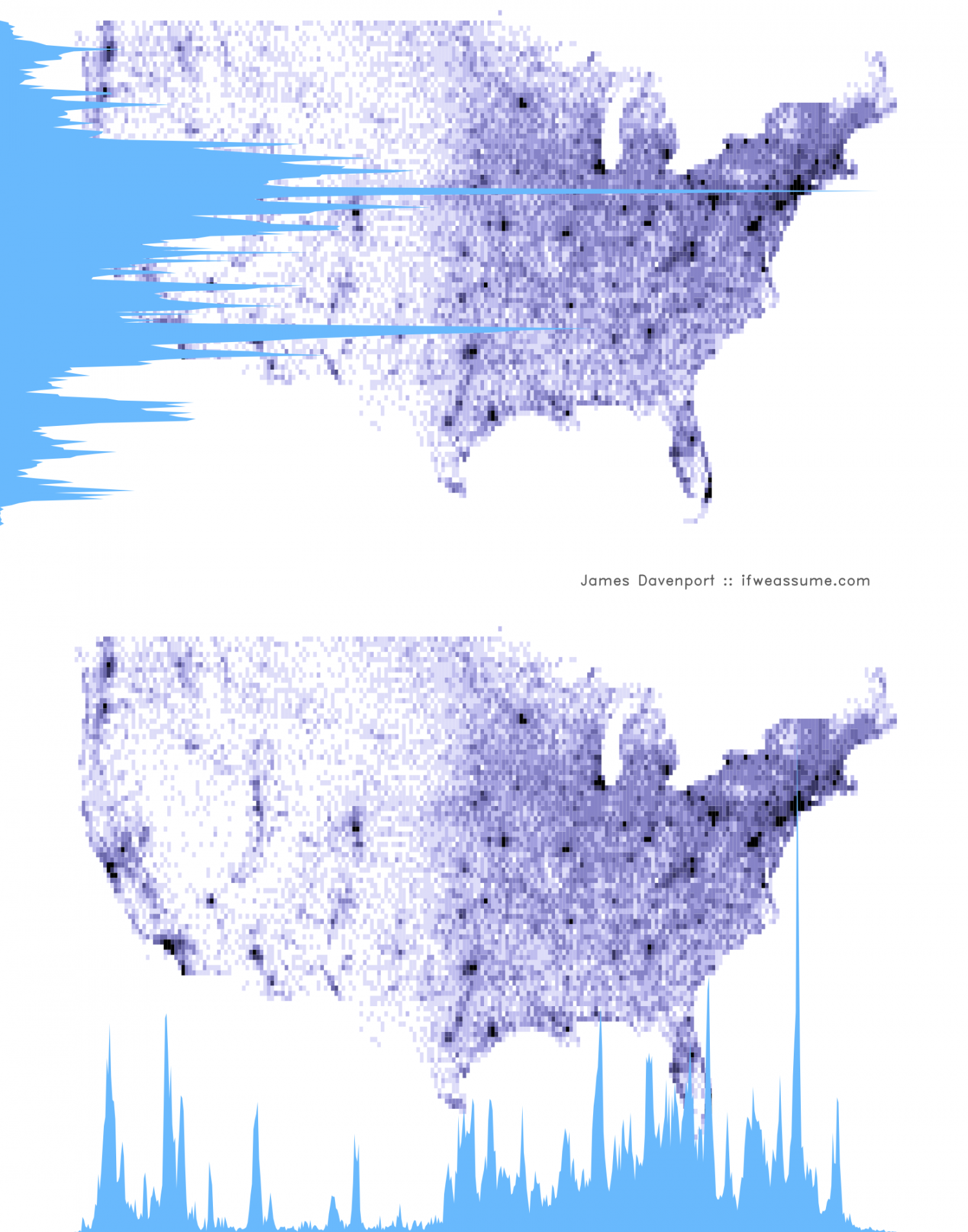
US Population By Longitude & Latitude Credit: James Davenport
A similar story is told via the following map. However, a key difference is that the above map shows the distribution across the country, while the map below emphasizes change over time.
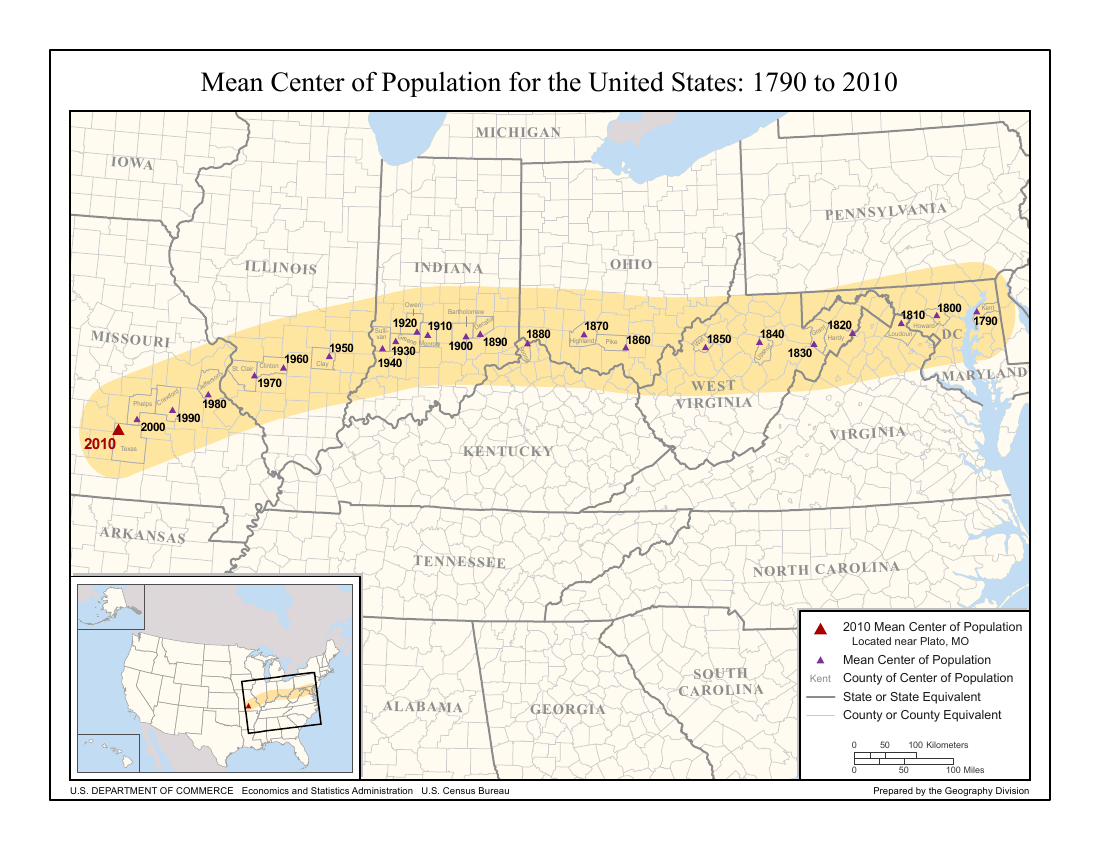
Mean Center of Population for the United States: 1790 to 2010 Credit: U.S. Census Bureau, Geography Division
Video based infographics
Sometimes infographics can come in video formats. This short about Coke has visual supports for the story in many of the ways that infographics do.
-
Links often suffer from link rot and cease to exist after some time. Many of the links on this page point to the location of the source in the Internet Archive. ↩︎
Categories:
Hugh Paterson III
Collaborative Scholar
I specialize in bespoke research at the intersection of Linguistics, Law, Languages, and Technology; specifically utility and life-cycle management for information products in these spaces.